How to Chart Options
It's very helpful to be able to chart the payoffs an option can return. This page discusses the four basic option charts and how to set them up.
Long a Call
The first chart we'll make shows what happens when you Long a Call (buy a call option). When you buy a call option, you must pay a premium (the price of the option). You can make a profit if the value of the underlying asset sufficiently increases.
The chart is set up using $ (or some other currency) on both the x and y axes. The x-axis represents the price of the underlying asset or "S" (like the stock). To draw the lines we will be placing on the chart, it is best to set up the following helpful table.
| At Maturity of Option |
|---|
| S < X | S = X | S > X |
|---|
| Call | 0 | 0 | S-X |
|---|
| Premium | -c | -c | -c |
|---|
| Total | -c | -c | S-X-c |
|---|
On the second row of the table the three scenarios of the asset's value are given: the asset's value can be less than the strike price, equal to the strike price, or greater than the strice price. The next row shows the value of the call option for each scenario. If the asset's value is less than or equal to the strike price, then the call option is worthless; however, if the asset's value is greater than the strike price, then the call option can be used to make a profit of S-X. The next line shows the cost of the premium at each scenario--since we are long on the option, the premium is some negative number (whatever was payed to purchase the option). The last row is simply a total of the two rows above it. You can see that a profit is made only if S>X and S>(X+C).
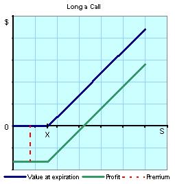
To make the chart, we first must plot the strike price on the x-axis. This is represented with an "X". The blue line represents the payoff of the call option. If S is less than X, the payoff of the option is 0, so it will follow the x-axis. After reaching the strike price, the payoff of the option is S-X, so the line will increase at a 45 degree angle (if the numbers are spaced the same on both axes). The green line represents the profit from excersizing the call option. It runs parallel to the payoff line but since it takes into account the price that was payed for the premium (the cost of the call option) it will be that far below the payoff line.
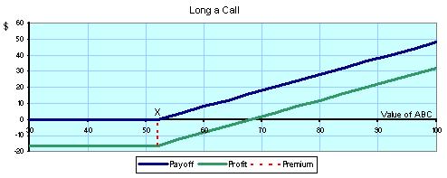
Perhaps an example would be helpful:
Let's say you are purchasing a call option for ABC stock
X (strike price): $52
Premium (cost of option): $16
| At Maturity of Option |
|---|
| ABC < $52 | ABC = $52 | ABC > $52 |
|---|
| Call | 0 | 0 | ABC-$52 |
|---|
| Premium | -$16 | -$16 | -$16 |
|---|
| Total | -$16 | -$16 | ABC-$52-$16 |
|---|
So plugging in some values for ABC stock at maturity, let's see what you would have earned:
| ABC Stock Value: | $40 | $50 | $52 | $60 | $68 | $80 |
|---|
| Payoff: | 0 | 0 | 0 | $8 | $16 | $28 |
|---|
| Profit: | -$16 | -$16 | -$16 | -$8 | 0 | $12 |
|---|
The graph would look like this:
Now that we've got the first chart out of the way, we can move a bit quicker and show a few other charts.
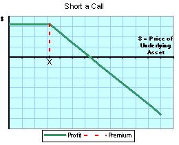
Short a Call
Now we'll see what happens when you Short a Call (sell a call option). Since you are writing the option, you get to collect the premium. You'll only end up losing money if the value of the underlying asset increases too much since you'll be forced to sell the asset at a strike price lower than market value.
Here's our nifty table:
| At Maturity of Option |
|---|
| S < X | S = X | S > X |
|---|
| Call | 0 | 0 | -(S-X) |
|---|
| Premium | +c | +c | +c |
|---|
| Total | c | c | X-S+c |
|---|
The chart doesn't really need a payoff curve since you're not the one holding the call option. The profit will hold steady at the premium until it reaches the strike price, at which point every dollar the asset gains is a dollar you will lose.
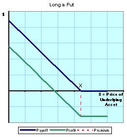
Long a Put
Buying a put option gives you the right to sell the underlying asset at the strike price. When you long a put (buy a put), you will profit only if the price of the underlying asset decreases.
Let's start by setting up the table; this time we'll use "p" as the price of the premium:
| At Maturity of Option |
|---|
| S < X | S = X | S > X |
|---|
| Put | X-S | 0 | 0 |
|---|
| Premium | -p | -p | -p |
|---|
| Total | X-S-p | -p | -p |
|---|
You can see from the table that in order for the option to return a profit, the strike price must be greater than the asset's price plus the premium (X > S + p). This makes sense--the option will only give a payoff if the asset is below the strike price. The payoff less the premium will be your profit.
The chart looks just like the "Long a Call" chart except it's flipped vertically at the strike price.
Short a Put
Our last simple but helpful option chart shows what happens when you short a put (sell a put). Since you are the writer of the put in this case, you are happiest when the asset's value doesn't fall below the strike price.
| At Maturity of Option |
|---|
| S < X | S = X | S > X |
|---|
| Put | -(X-S) | 0 | 0 |
|---|
| Premium | +p | +p | +p |
|---|
| Total | S-X+p | +p | +p |
|---|
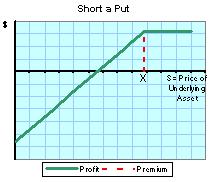 Here's the chart. Again, since you don't hold the option we've only included a "Profit" line and not a "Payoff" line. Here's the chart. Again, since you don't hold the option we've only included a "Profit" line and not a "Payoff" line.
Now that you have seen the four basic types of options charts, we can do some stuff that's a lot more fancy and understand option-trading strategies that are a bit more tricky.
|